What graph visualisation teaches us about beneficial ownership

We’re excited to be launching a new version of our graph visualisation functionality to the Open Ownership Register. We hope this will act as a powerful resource for journalists, policy makers and civil society by allowing them to more easily interpret the data to expose corruption, undertake due diligence and support policy impact.
When the OpenOwnership Register launched in 2017 with the UK’s PSC register data, our priorities were twofold: make the Register a one-stop shop for beneficial ownership investigations and gain insights into the best model for an international data standard.
In order to support data use, we quickly released the ability to search not just by company name or number, but also by beneficial owner name - a feature still missing on the official Companies House website. We later developed a very basic family tree graph featuring UBOs (Ultimate Beneficial Owners) at the top. Two years on, with the addition of beneficial ownership data from Denmark, Slovakia, Ukraine and EITI, and having amassed significant research on investigation and due diligence best practice, it was time to take graph visualisation to the next level.
Expert beneficial ownership data users already rely on graph visualisation, but many users are still excluded
The first step on this journey was to verify some of our assumptions with users themselves. We convened a discovery session or ‘Data Jam’ with beneficial ownership data users, in order to understand how they used visualisation in their work (be it journalistic investigation, Know Your Customer (KYC) or due diligence), and the tools that some of the more tech-savvy users were already using.
Graph tools such as Linkurious and Neo4J Bloom turned out to be reasonably popular amongst data journalists and campaigners, who had become increasingly dependent on the analytical power of graph visualisation to investigate very complex networks of ownership. Unsurprisingly, there were custom solutions being developed by KYC and due diligence providers, and sometimes by end users as well (using D3 for example).
However, it quickly became clear that the expense and steep learning curve required to customise and use these tools excluded a number of users. Many key stakeholders interacting with governments and decision-makers didn’t use visualisation at all. We wanted to open up this functionality as visualisation can act as a powerful storytelling tool to showcase the importance of disclosure and open data.
With those insights gained, we were ready to ship a minimum viable product through our 3-week sprint cycle. We chose to use Cytoscape JS due to its broad set of features and ecosystem of plugins. We committed to the following features, previously unavailable on the Register:
- Ensuring that a graph was available not just from a company search result, but also a person search result
- When searching by company, the possibility to walk ‘up’ the ownership tree via all intermediary corporate ownerships (when available), and also to walk ‘down’ to show all the companies owned by the target company
- Greying out ceased relationships, to differentiate them from current ones
Adding to this, we were also able to significantly improve on our previous graph version thanks to features we had already shipped:
- Deduping of person records: this was particularly valuable for the UK PSC data, which is missing unique identifiers, meaning the same person was previously appearing as different people in the same graph.
- Updating company records: this was to ensure that we knew whether a company had changed names or been dissolved: they would now appear as greyed out entities when dissolved.
Graph visualisation is a game-changing analytical tool for complex beneficial ownership networks
In order to demonstrate how powerful graph visualisation can be, even when the feature is only an MVP (Minimum Viable Product), let’s look at specific data examples from the Open Ownership Register.
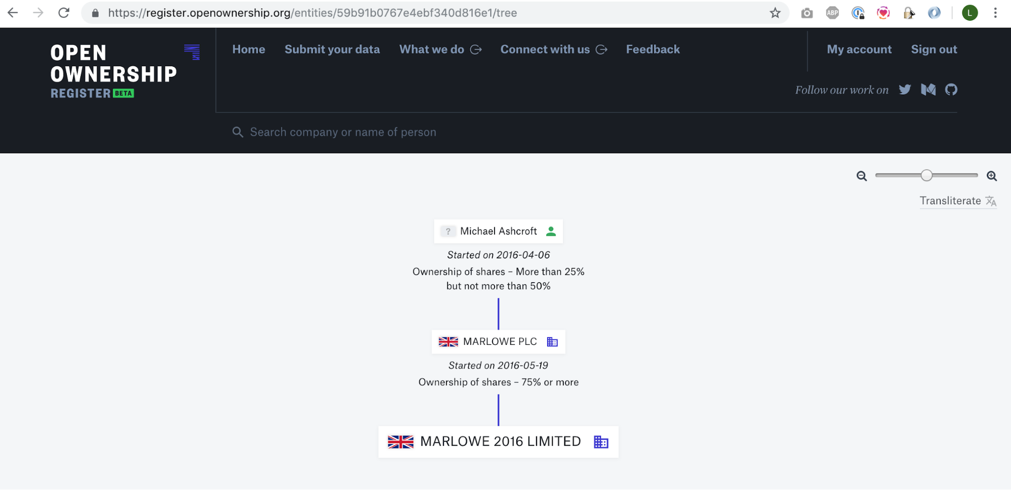
We’ll start with the Right Honourable Lord Ashcroft, given that he is a well known international business person. He has a vast financial empire, spanning from the UK to Belize. We will concentrate on a small subset of that empire: ‘Marlowe 2016 Limited’. The previous visualisation showed the UBO of ‘Marlowe 2016’ as being Ashcroft himself and it showed the company in-between, called an RLE (Relevant Legal Entity - beneficial ownership legal concept specific to the UK-), here ‘Marlowe PLC’. But nothing else. If the purpose was purely to identify the UBO, it worked.
Before
After
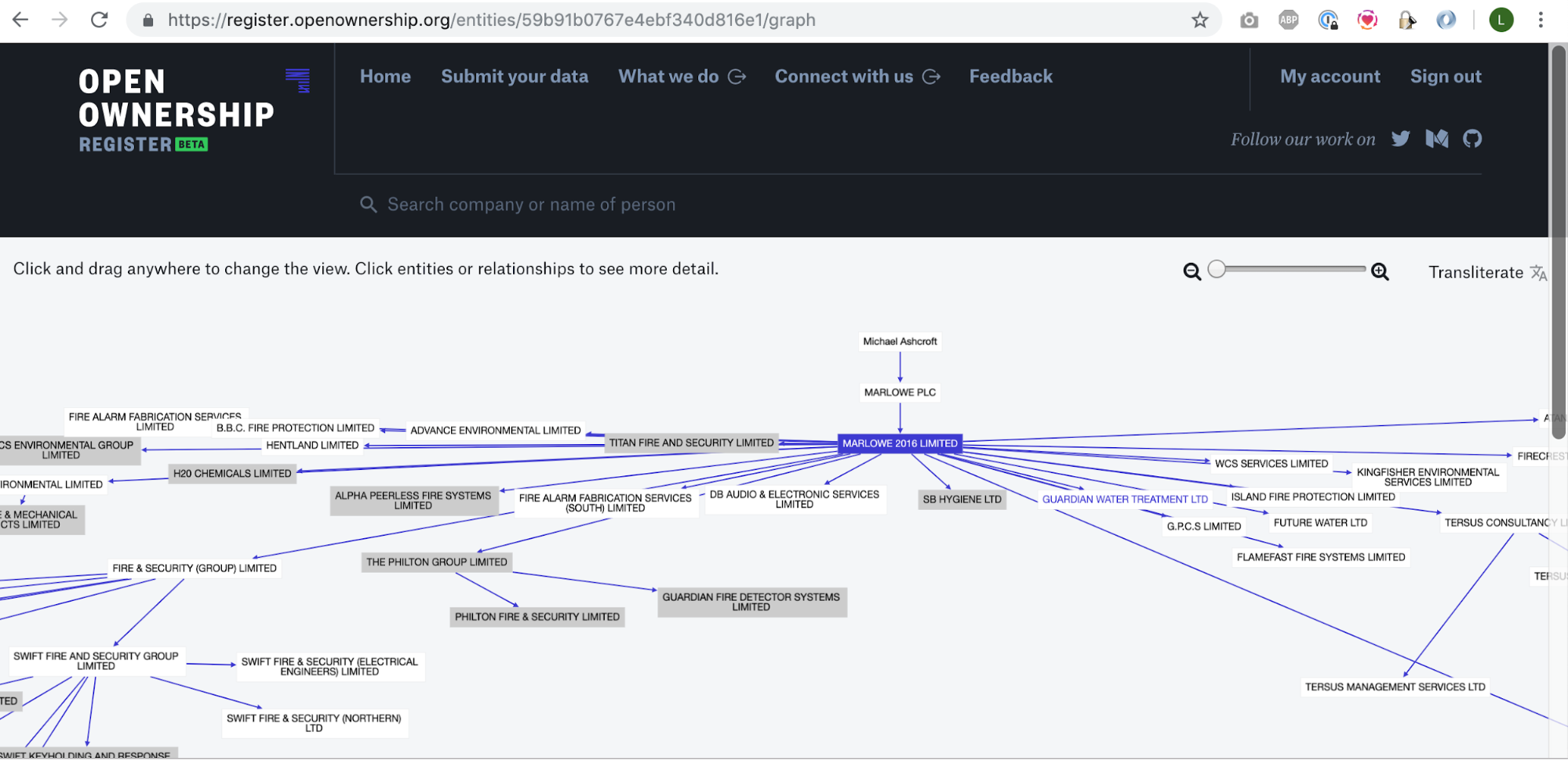
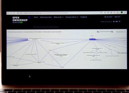
With the new graph, which now displays the companies owned by ‘Marlowe 2016’ by default, a couple of things quickly become obvious: the significance of ‘Marlowe 2016’, the complexity of the ownership network (which could be questioned in itself), and the sphere of influence of Michael Ashcroft as a beneficial owner. This assessment can be made in the blink of an eye and is facilitated by the graph’s ability to connect direct and indirect owners, corporate and personal ownership in all ‘directions’, up to the UBO but also down to other corporate entities, the ownership of which could inform the main investigation.
With the ability to view a person’s network, previously unavailable on the Register, it is now possible to understand how far reaching a single person’s control can be. We have allowed analysts to uncover ownership from a single lead, and have enough of an overview to explore specific nodes in depth, if required. This can currently be achieved by clicking through each name/entity. Further improvements would accelerate node navigation (including being able to do it in a single space rather than clicking away, as is now the case), but already from one name and with one click you can uncover a vast beneficial ownership network, when it was previously either entirely unavailable, or hidden in unwieldy rows of data.
So now we have a more powerful way of visualising beneficial ownership data, but what does this mean in terms of policy impact? Read our next blog to find out…